

My favorite part about fall is that I feel like drinking hot lattes again. So I thought some coffee-themed cards would be great to showcase for this time of year.
I used a book of patterned paper from cutcardstock.com that has a lot of great graphic options and patterns. I also chose Basis cardstock in dark brown and dark orange to accompany my other options.
The gold wood grain scrapbook paper is also available at cutcardstock and is so detailed and beautifully reflective in real life.
Don't forget to watch the full video tutorial below:
Don't forget to watch the full video tutorial below:
First, I planned out my cards. I knew I wanted to make 4 and to include a coffee cup in each design so I figured out which sentiments were going on which cards and the general layout. I had little sketches or wireframes to work from so I wouldn't forget.
I started by trimming the gold wood grain to fit on each design. Some require just a strip, some are going to be mostly wood grain backgrounds.
I then cut out some custom coffee cup designs I created in photoshop and made into a Silhouette  cut file. I took apart the cut pieces and started to arrange and layer the elements so I could figure out what looked best.
I wanted the “coffee” in the cup to be a different color paper, so I traced the shape out onto dark orange cardstock.
I also wanted to create some depth to the layout, so I decided to use Ranger Tim Holtz Distress Oxide Ink Pad VINTAGE PHOTO to blend some dark brown coming in front the top.
I added some water splatters for a coffee-stained look.


Once that panel was trimmed, I used an ATG gun to glue it to the scrap on scrap paper I wanted to use as a background for this piece.
I trimmed down the whole card front, leaving behind a thin white border once mounted to the card.
I then added some ink blending to coffee piece, for more added dimension.
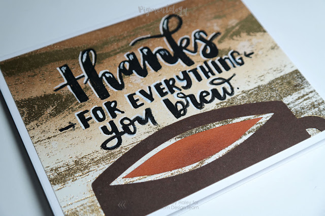
I did the sentiment on the coffee cup and pre-sketched the layout before going over it with PH martin’s bleed proof ink.
I added a shadowing effect as well, with a pentel touch pen.
I wanted to add a bit of gold to the cup, so I prepped the paper with an anti-static tool I made and stamped a little heart from a recollections stamp set with versamark ink.
I then covered it with Ranger Embossing Powder, Princess Gold .
.
Whenever I heat small pieces like this, I like to use tweezers to keep from burning my fingers. I used my ranger heat it craft tool to melt the powder.
I adhered this piece to the card panel with Ranger Multi Medium, Matte  , and added the coffee to complete the design, laying it all aside to dry with something on top of it.


Starting on the next card, I added some dimension again with distress ink in vintage photo. I also added water splatter texture. Then, I attached it to the patterned panel with an ATG.
After trimming everything to size, I arranged the coffee cup die cuts and started gluing them down. For some reason I switched to using Tombow mono aqua glue. I set everything aside to dry and worked on it later.


Starting on the third design, I traced a circle onto the brown card stock and made a notch for a representation of the handle. This would be the coffee cup in aerial view.
I traced a smaller circle onto the orange card stock and cut that out, to represent the coffee. I wanted to use coffee beans in the design somehow but wasn’t totally sure yet.
I inked up the edges of the coffee circle with distress ink and pieced the paper together.
For the background panel, I grunged up the gold wood grain with some watered down distress ink. I used a variety of methods for creating splashes, including blowing with a straw, and letting the dyed water fall from the acrylic block I was mixing on.
I trimmed the panel and started getting to work on lettering the sentiment, which I also sketched before starting. I used a white sakura gel roll for the thinner letters and the PH martins bleed proof white and a very small brush for the brush lettering.
I decided to glue the bean on as part of the message using Judikins Diamond Glaze.
Going back to the second design, I trimmed the excess paper off with large scissors before starting on the sentiment panel.
I cut a ribbon end into a piece of dark orange card stock that would serve as a background for the lettering.
I practiced the lettering on scrap paper first, before doing it all on the ribbon panel with the same brush and white bleed proof ink. I also added shadowing to this one with the pentel touch pen.
For those unaware, I am a barista and this particular card would be going to my new manager as we open a new store. “Candellila” is a kind of coffee, and I knew he’d get the reference.
Once finished, I glued the ribbon panel on with tombow mono aqua glue.

For the final design I distressed the wood grain again and I cut out the coffee shape I needed from the piece of dark orange. Then I figured out placement, glued, and trimmed.
For this one I lettered with a pentel pocket brush pen. Because the ink didn’t cover the gold bits, I went back in with a Molotow Paint Pen to make the lettering more opaque.
I also added white highlights with a white molotow pen.
Once finished and all the card fronts were glued onto folded cards .. we’re done! I ended up going in and adding a lot more details and tweaks. I think my managers at work will love them!
- Haley
www.pigmentology.com
Instagram // Facebook // Etsy // Youtube
- Haley
www.pigmentology.com
Instagram // Facebook // Etsy // Youtube


No comments
Thank you for visiting the CutCardStock blog! We appreciate your comments.